The logic of the Society's logos
The original logo of the Pataphysical Society of New York was designed for its first website in 2010, made in Photoshop by M. Stoff. It remained the primary visual identity of the Society for well over a decade, and in that time it traveled considerably further than anyone had planned.
The design was a synthesis of two symbols: the guidouille, or belly-spiral of Pere Ubu, and the question mark. The guidouille is among the most universally adopted motifs in pataphysical iconography. It derives from the great expansive gut of Ubu, the monstrous sovereign of Alfred Jarry’s theatrical cycle, and it has served as a kind of heraldic charge, representing pataphysicians since at least the mid-twentieth century. It is worth noting that the gidouille’s prominence is more a product of the institutions that followed Jarry than of Jarry himself, who deployed it as one element among many. But the spiral endures. It has been employed extensively by the College de Pataphysique, on the covers of books and journals, and accompanying most contemporary references to pataphysics as a general shorthand for the dizzying nature of the Science.
The Society’s logo attempted to move beyond this idea with the introduction of the question mark. The rationale may be self-evident, but for the record: Pataphysics, as the science of imaginary solutions and the laws governing exceptions, implies that for any given proposition, an infinity of equally valid and opposite outcomes obtain. No particular result can be predicted, no particular truth privileged over its contradiction. The question mark was an attempt to render this graphically: the state of perpetual unknowability, the cosmic shrug at the heart of the discipline.
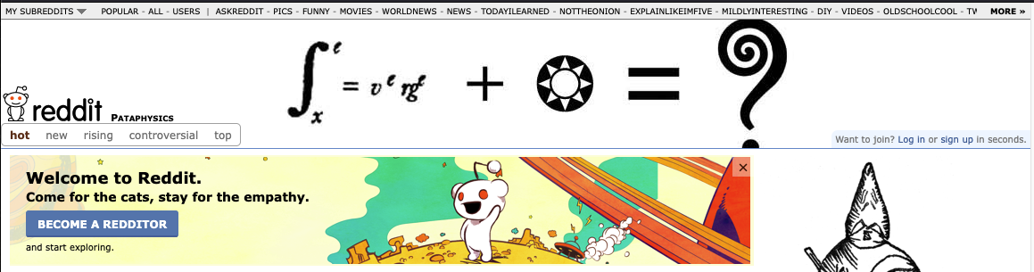
The logo proved unexpectedly portable. It began appearing across the internet as a general-purpose emblem of pataphysics itself, detached from the Society that produced it. The header of r/pataphysics, the Reddit community dedicated to the Science, adopted it. It surfaced in blog posts, social media avatars, and presentation slides by people with no formal connection to New York or its Society.
By 2023, the Society had begun a broader reckoning with inherited practice. In the face of mounting international differences in the practice of pataphysics, could any single motif from the received tradition continue to adequately represent the scope of the science? It is actually repulsive to the principles of pataphysics to attempt such a reduction of an infinite science to one of its particular expressions.
And so the redesign began with a subtraction. The guidouille has since been retired, and in its place, the Society turned to language.
The motto of the Pataphysical Society of New York is: “Never not, except when so; if thus not or but and!” It is, as far as its authors can determine, the purest compression of pataphysical doctrine into a single sentence.
“Never not, except when so” establishes the primacy of the exception. It is also an argument for the identity of opposites, what the literature sometimes calls equivalence. “If thus not or but and” extends the principle through successive degrees of removal. Criticism of a proposition does not escape the equivalence; it is subject to the same law. Nor does criticism of the criticism. Metacriticism, and meta-metacriticism, and every further regression falls under the same regime. The exclamation mark is perhaps extravagant. But in pataphysics, extravagance is not a vice. There are no historical bounds on the emotional latitude of practitioners. The truth of the poetry remains beyond reproach.
The 2023 logo renders this motto as visual identity. Where the guidouille pointed to one tradition within pataphysics, the motto points to the principle underlying all of them. The Society’s ambition, in this as in its other endeavors, is to return to fundamentals rather than perpetuate received practice. The institutions that came after Jarry produced many beautiful things. They also produced orthodoxies, to which our Society expresses an appropriate indifference.
The original logo, for its part, has not been destroyed. It continues its independent, pixelary life, representing the Science to strangers who may never learn where it came from. And they will never know the origin of the wind that keeps them from burning under the infinite fire of the sun.